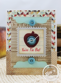
Hi guys! I've got a card and video to share with you today. Paper Crafts Magazine has been celebrating their latest special issue Card Design Handbook all week. It's a great issue and goes into detail on all of the technical design terms that explain the foundations of "good design". I've never really been one to follow rules just for the sake of following them. I usually start working and tweaking as needed by referring to the basic rules as a guide if something just isn't working. You can see a little more of my process in the video below:
Watch above or in HD at YouTube
The rule of "three" isn't something that I usually take literally. I tend to pay more attention to visual weight. For example, the blues in this card; they are represented 3 times, in the patterned paper in the background, in the light aqua in the second layer, and then again in a darker shade with the buttons in the foreground. I chose to go darker because I didn't want a huge contrast between the apple and buttons. I think they work more harmoniously together since they are both in the same depth of shade. Remember, matchy-matchy isn't always the best route. If you want to add instant interest, add something unexpected.
I used a classic rule of "framing" to draw attention to the focal point as well. This could fall under movement. The buttons lead your eye from either the top or bottom straight to the sentiment. Having the lighter mat helps to push the entire focal point to the front. Since the overall design is quite busy with a lot of pattern paper, I chose a muted color palette with just a few pops of brighter color to create a sense of balance in the overall design.
I hope at least a little bit of that made some sense. If not, please excuse my rambling! Quite frankly, I don't realize while I'm creating that there is that much thought going into it. But I guess once you step back and start analyzing it, there is. Or at least we can BS and make it sound that way! ;o)
Thanks for stopping by, and I hope you are having a great week. It's almost Friday!!! Woot, Woot!
Project Supplies

You're The Best
Stamps: Design Basics: Classroom Backgrounds, Class Act (Wplus9)
Ink: Riding Hood Red, Baja Breeze (Stampin' Up!); Tim Holtz Distress Ink in Antique Linen & Vintage Photo (Ranger)
Card stock: Oatmeal (Wplus9); Aqua Mist (Papertrey Ink)
Patterned Paper: Clippings (Basic Grey)
Tools: Clear Cut Stackers: Pinking Squares Die, Pretty Patches: Apple Die, Label Layers 2 Die (Wplus9); buttons (Papertrey Ink); crochet thread


Love your card and video! I had to laugh when you said you didn't realize how much thought goes into a card. I think it is because once you understand the process it becomes automatic.
ReplyDeleteTFS your talent!
LOVE the card and video.....Thanks for sharing!
ReplyDeleteGreat tips, Dawn, great video and great card!
ReplyDeleteLOL Your hilarious, really like the designs and great stamps and paper
ReplyDeleteThanks for sharing sweetie
Love this card, Dawn, and your videos are really fun to watch.
ReplyDeleteFantastic card, Dawn! I adore the apple die... perfect for fall. And thank you so much for the lovely comments on my blog. You made my day! :-)
ReplyDeleteVery cute, love the video. I'm usually the same when it comes to creating cards, I crate as I go and change things as needed!
ReplyDeleteGreat video Dawn! I so enjoy watching you create from start to finish!
ReplyDeleteI just love all the new stamps and am enjoying creating with them so much!!
your card is beautiful Dawn :) x
ReplyDelete