It's time for another Throwback Thursday Challenge. I'm a huge fan of making gift sets, especially this time of year with Teacher Appreciation Day coming next month. I don't always send a lot of gifts into the schools throughout the year, but I always like to make card sets and send handwritten notes thanking our teachers for all of their hard work during the school year on Teacher Appreciation Day. So this month, we our TBT set is
Monogrammed.
This month I've made three card sets featuring Monogrammed and three different techniques using the newly released PURE COLOR Spray Mists in
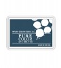
Lake House,
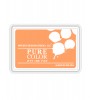
Sweet Gelato,
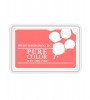
Sweet Nectar and
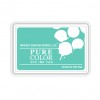
Bloomsberry.
This first set is fun and trendy with the clean lines of the monogram paired with the sprayed ink and sequins. I die cut four white panels using the Love Showers Layers Die, then sprayed each one with Spray Ink, concentrating the color in the upper left corner. Then I stamped the bottom using the stripes from Country Charm and the Monogrammed letters. Each card was embellished with sequins that coordinated perfectly with the Spray Mists.
The next set is also right on trend.
Wplus9 Supplies:
I love the versatility of the PURE COLOR Spray Mists. This time I poured just a bit of each of the spray mists into a paint palette. With a large brush I covered a 4 1/4 x 5 1/2 inch piece of watercolor paper with clean water. Then I came back with a smaller brush and dropped in some of the Spray Mist. I let the water move the color around and then heat set it to create even more movement. I created a frame for each card using the Holiday Apertures Dies and adhered everything to a white card base.
The last set uses a combination of colors.
Wplus9 Supplies:
To make these last cards, I sprayed a large acrylic block with two spray mists (Sweet Gelato and Sweet Nectar on one and Lake House and Bloomsberry on the other), then sprayed them with just a bit of water. I took a piece of white cardstock and pressed it into the ink to get a fun watercolored look. To make the little splotches on the white panel I removed the top of the Spray Mists and flicked the spray from the bottom of the nozzle.
Play Along
Now it's your turn! We'd love to have you
participate in our Throwback Thursday posts. We know you've got some
older product in your stash dying to see some ink! So let's pull em out.
Use any card above as inspiration, or even the stamp set if you've got
it, and let's see those "oldies but goodies" get some love!
Use
at least one Wplus9 product and upload your project to your blog or
online photo gallery such as Flickr. Then link it up using the InLinkz
widget below to share it and keep the inspiration flowing! You'll have 3
weeks to play along.
EXTRA ENTRIES: Post your creations on Instragram using the hashtag #wplus9tbt for an extra entry!
Prize
We will select one random random participant to receive a $20 store credit to
wplus9.com. Winners will be announced on Thursdays when the new Throwback Thursday is posted.
TBT #2 Winner
Contact us at customerservice@wplus9.com with your full name and email and we will set up your store credits! (If you don't already have an account set up with us, be sure to set one up to expedite collecting your prize)