Showing posts with label Epic Dad. Show all posts

Wednesday, July 2, 2014

The Illusion Of Layers

Hi! Kara here.

I saw an image posted on Pinterest {where else?} with cute bow ties. It made me think of my dad who asked if he could wear a bowtie to my wedding. He's old school like that ;) Of course, I said yes.

I thought a fun, graphic bowtie birthday card would be perfect for him.

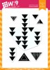
To create my bowties I used a few triangle images from the Just Geometrics: Triangles stamp set.

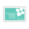
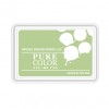
I stamped them in Mojito and Ocean Drive PURECOLOR Dye Ink and finished each one off with a rhinestone.

I wanted to mat my card front in a coordinating color cardstock, but didn't have any that matched. So here's how I created my custom "faux" mat using ink.

Step-by-Step Instructions:
  1. Tape off the edges of your card stock in the desired width. I just eyeballed the white space that I wanted left around the outside of the 'mat' and added some painter's tape, it's about 1/4 inch. (Try varying the size for different looks!)
  2. Use a sponge dauber to apply ink to the revealed card stock. (I swiped the color from the edge inward to avoid color seeping under the tape.) You only need to go in as far as will show. No need to color areas that will be covered by the top panel.
  3. Carefully remove the tape; it can tear your paper. (If your tape is too sticky, try removing some of the "stick" by pressing the sticky side to your skin and removing it before applying it to your card stock.)

SUPPLY TIP: You can also try using Masking Paper or Post It Tape instead. On a second attempt I used masking paper instead and it was much gentler on the paper and gave a much cleaner edge. I'll link some in the supplies below. But, in a pinch...well, we all have painter's tape on hand. ;o)

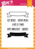
For my sentiment I die cut 'dad' from the Epic Dad die set from white card stock. I added color to it using Ocean Drive ink and a dauber. I stamped the banner from Basic Banners in black ink and cut it out however, there is a coordinating banner die.

A very simple technique for stretching your basic supplies. White cardstock is all you need, especially with these PURECOLOR Dye Inks!

This is also a great technique for eliminating some bulk while still giving the illusion of layers. Try adding a second color to make it look like it is double matted.....

Thanks so much for joining me today!

Wednesday, May 14, 2014

Nail Polish Marbling

Hi, It's Kara!  Recently I have been experimenting with different mediums to create marble effects. My favorite so far is definitely the nail polish technique and I'm excited to share it with you.

It's so easy, a little messy, but the effects are so beautiful.  When you lift your paper up and look at your results you'll have one of those, "Ohhh!" moments. The results are different every time.

Before you get started you will need to gather your supplies:

Supplies:
  1. A shallow disposable container filled with a few inches of water
  2. Nail polish in desired colors
  3. A tool to swirl your colors together {ex; the end of an old paintbrush, a toothpick}
  4. Watercolor paper
  5. Gloves {optional}

Before you begin, make sure you are in a well ventilated area because the smell from the nail polish can be quite strong. If you've just gotten a manicure you might want to wear gloves. Chances are you'll get some polish on your hands.  But, everything cleans up easily afterwards with nail polish remover. I like to shake all of my colors and remove the caps before I begin.  You have some time, but do have to work quickly since the nail polish begins to dry.

Instructions:
  1. Drizzle each color onto the surface of the water with a steady hand. You want the polish to float on the surface rather than sink to the bottom of the container.
  2. Once you have added all of your colors use your tool to swirl the colors together until you are happy with how it looks.
  3. Lay your watercolor paper onto the surface of the water and lightly press making sure the entire surface of the paper makes contact with the polish and then lift off.
  4. Set the piece aside to dry.  Once it is dry you can use it as a background, die cut it, stamp on it, glitter it, or anything else you can imagine!
***Try experimenting with different amounts of polish and colors to see the different results

Here are a few examples of how I have used the marbled papers I have created. 


Wplus9 Supplies:
Stamps: Epic Dad, Strictly Sentiments 4 // Dies: Epic Dad Die // Cardstock: White, Black

Wplus9 Supplies:
Stamps: Fresh Cut Florals  // Dies: Quilt Cuts 2 // Cardstock: White

I hope you give this technique a try.  Think beyond just paper.  See those pencils and wood veneer butterflies?  Yup, I marbled them too!

Friday, May 2, 2014

Epic All The Way

It's my last day on the WPlus9 blog, and this time I'd like to share a few 'epic' cards :)

I find myself quite fond of that particular word die from Epic Dad. Once I pulled it out of the package I didn't want to put it away. On the card below I used it to create a 'shadow word'.

I stamped the rays from the retired Super Star stamp set once on the panel and once on the die cut word, checking the alignment carefully. I also die cut the word with a strip of the pink cardstock at the bottom, it makes the further alignment a bit more fiddly but it's worth the fuss.

I stamped the word 'dad' from the same retired set, in Lake House Dye Ink and the rays + the sentiment above the rays in Wild Mango. The pattern from Borders and Backgrounds 4 was stamped at the bottom of the panel in black. I finished the card by adding a few diagonal strips of White cardstock to the card base.


Wplus9 Supplies:
Stamps: Borders & Backgrounds 4, Super Star // Ink: Lake House Dye Ink, Wild Mango Dye Ink // Dies: Epic Dad Die // Cardstock:White

I inked up Borders & Backgrounds 4 again here, in order to create a masked background on this stepped up one-layer card. I stamped the pieces in Sweet Gelato, Sweet Nectar, Bloomsberry and Silver Lining Dye Inks. Then I added a thin strip of black cardstock to the bottom of the card.

I pulled out the retired Super Star stamp set once again, to stamp the wording above and under the Epic Dad die cut. I also stamped the arrows from Cupid's Arrow to accentuate the word.

The word 'epic' was die cut once from white and once from black cardstock, and the pieces aligned to create a shadow.


I have one more card to share, this time I played with the Epic Dad stamp set and a whole lotta spray mists :)

I misted the panel first, and once dry I applied a thin layer of white gesso over some of the misted areas to mute down and grunge the colours. Then I stamped the sentiment, partly in black and partly in White Pigment Ink & Cranberry Crush Dye Ink. I stamped the outline in white first, and then the filling in red. The effect is subtle but makes enough of a statement.

I also stamped he word 'epic' a couple more times around the sentiment, using the secondary stamping technique - I stamped off some ink on scrap paper first, and then on the panel with the remaining ink, thus making a lighter impression. I used Appletini and Silver Lining Dye Inks for this.

I finished the card with some washi tape and a wood veneer star, which I smudged some more ink over.


Wplus9 Supplies:
Stamps: Epic Dad  //  Ink: Cranberry Crush Dye Ink, Appletini Dye Ink, Silver Lining Dye Ink, White Pigment Ink // Dies: Epic Dad Die // Cardstock: White

Thank you for joining me this week, I hope you had as much fun checking my cards out, as I had making them!

Wednesday, April 30, 2014

One For Mom, One For Dad

Hello, Chupa again with two more cards and an inspiration for Mother's Day and Father's Day alike!

First up, a  one-layer with a fussy cut floral accent, using the beautiful Spring Blooms and Strictly Sentiments 4. I stamped the foliage on Kraft Cardstock, first with Lake House Dye Ink and then over-stamped with White Pigment Ink, while stamping the second time a little bit offset to give the images depth.

The petals of the flowers were "sugared" with a coating of glitter glue, die cut with the Spring Blooms Die and mounted with dimensionals with the petals curled up just slightly.

The sentiment was simply stamped in black, the fancy font is a stand-out and is all the card needs to take it to the next level.


Wplus9 Supplies:
Stamps: Spring Blooms, Strictly Sentiments 4 // Inks: Lake House Dye Ink, White Pigment Ink // Dies: Spring Blooms Die // Cardstock: Kraft

Next up, is a rad card for a dad! It started by stamping some Ink Splats on Oatmeal Cardstock panel, with various Dye Inks: Appletini, Nautical Navy, Silver Lining and Wild Mango.

Then I die cut the shadow 'dad' shape with the Epic Dad Die and stamped the sentiment from Epic Dad over the splats.

I mounted the panel on the card front and over some freely arranged patterned papers, and fitted the die cut sentiment back in, only using a flat adhesive instead of foam tape and thus creating dimension.

Then I cut the crown with the Epic Dad Die from glitter cardstock, stamped the 'you're swag' sentiment from Epic Dad on a scrap piece of cardstock, cut out and mounted on the panel.


It was great to 'see' you again, tune up tomorrow for some more inky fun!

Thursday, April 24, 2014

Clean, Graphic & Epic

I'm switching gears today and focusing on the clean and graphic style of design.

My first card features Epic Dad stamps and companion die, Ink Splats and Backgrounds & Borders 4. The bold patterns combined with the graphic nature of the sentiments in Epic Dad are perfect for clean and graphic cards.

Monochromatic cards are a great choice for men.

I started by stamping the card base with Backgrounds & Borders 4.  Then I got out my Oatmeal Cardstock and had some fun with the Epic Dad stamps and dies.  I added a bit of shimmer to the crown using a Wink of Stella pen.  I know guys don't like a ton of glitter, but you can't have a crown that doesn't shine!

Wplus9 Supplies:
Stamps: Epic Dad, Ink Splats, Borders & Backgrounds 4, Banner Basics // Dies: Epic Dad Die // Cardstock: Oatmeal, Kraft

My next card is more appropriate for the tween/teen scene rather than Dad.

Wplus9 Supplies:
Stamps: Ink Splats, Epic Dad // Inks: Sweet Gelato, Silver LiningLake House Dye Ink // Cardstock: Black

This card was so much fun to make!  I didn't really fuss over placement, I just stamped.

Again, I played with some new-to-me color combinations from the PURE COLOR Original 10 Collection; Lake House, Sweet Gelato and Silver Lining paired with black.  Though I liked the simple stamping, I thought it needed a bit more.  Silver embossing, washi tape and an enamel dot finished off this card perfectly.

I hope you are inspired to make some clean and graphic cards.  See you tomorrow when I'm back to share more cards from the April/May release!

Wednesday, April 16, 2014

Masculine Cards Made Easy

Welcome Back!

Today I am switching gears from feminine to masculine. Many of us struggle with masculine cards.  Even when creating a very graphic card I have to resist the temptation to put a flower on it ;)

The Wplus9 April Release contains stamps and dies that make masculine cards easy to do.

This first card features a custom layered sentiment, for dad, created by mixing 3 of the new stamp sets, Hand Lettered Hello, Epic Dad, and Strictly Sentiments 4. The 'hello' and the darkest arrow in the background are stamped in Appletini Dye Ink and the color  works in beautifully with other inks in my collection to create a monochromatic look.

The background is created using a little arrow stamp from the Borders & Backgrounds 4. There are six arrows in the pinwheel pattern, 3 of each color.

This card is perfect for Father's Day or as a birthday card for dad.

My next card was created with my nephews in mind.  I have 5 of them ranging in age from 7-18.

I've made my fair share of boy birthday cards over the years. Although I made this card with the Epic Dad stamp set you can see it's not just for dads. It's perfect for boy's birthday, congratulations/special occasions and even feminine cards, as Joni showed us! I wanted to keep the background neutral and add pops of color on the main sentiment.

QUICK TIP: Make sure to thoroughly clean your stamp between colors. Allow each layer to dry before stamping a new color to prevent the colors from becoming muddy.

To create the focal point of the card I stamped 'epic' in black ink on the Epic Dad coordinating die and then heat embossed it with clear embossing powder. I used Ink Splats to stamp vibrant color with distress paints. I added a bit of paint to my craft sheet, tapped the stamp into the paint, and then tapped onto a clean section of the craft sheet to make sure I had an even layer of paint rather than a huge blob.  In between each color and when I was all done, I washed my stamp in the sink with water and a nail brush to make sure I got all of the paint off of the stamp.

The stripes and stars were added using stencils and black ink applied with a sponge dauber.

Wplus9 Supplies:
Stamps: Ink Splats, Epic Dad  // Dies: Epic Dad Die // Cardstock: White, Black

My last card today is a simple, one-layer card and matching envelope.

I love using kraft cardstock on masculine cards and  I think the Wplus9 Dye Inks look great stamped on it.

Thanks again for stopping by. I hope you're having a great day.

See you tomorrow!

Connect with us:

Follow Us on Pinterest