Saturday, July 9, 2011

July 2011 Release Day 3: Full Reveal

Welcome to Day 4 of our July Release. Today is the day that you get to see the sets we are releasing this month in their entirety. All products will be available for purchase on July 10th at www.wplus9.com.

C'est La Vie

Details

  • is a 6x8 clear photopolymer stamp set
  • contains 14 stamps; 9 images, 4 sentiments and 1 flourished frame
  • will be available for purchase July 10th for just $19

Label Layers 2 designer die

Details

  • coordinates with C'est la vie stamp set
  • measures approx. 2.5" tall x 3.6" wide
  • made from lead free American Steel
  • will be available for purchase July 10th for just $7

Defining Words

Details

  • is a 6x8 clear photopolymer stamp set
  • contains 7 stamps; 4 background building images, 2 word blocks, and 1 curly bracket
  • will be available for purchase July 10th for just $19

Hope Seed Co.

Details

  • is a 6x8 clear photopolymer stamp set
  • contains 23 stamps; 4 flower images, 18 sentiment builders and 1 border frame
  • will be available for purchase July 10th for just $19

Vintage Envelope designer die

Details

  • coordinates with Hope Seed Co. stamp set
  • measures approx. 3.5" tall x 2.75" wide when folded and assembled
  • made from lead-free American Steel
  • will be available for purchase July 10th for just $18

Thank you all so much for your enthusiasm and support. I really enjoy creating and seeing what you all create. Next month's release will be another of my favorites so I am looking forward to sharing it with you!

Friday, July 8, 2011

July 2011 Release Day 2

Welcome back to day 2 of our July Release! I am so thrilled with how much you guys are enjoying the previews so far. Just two more days until the entire release is available for purchase.

So let's continue, shall we. Today, it is my pleasure to introduce Hope Seed Co. and our Vintage Envelope die.

Hope Seed Co.

  • is a 6x8 clear photopolymer stamp set
  • contains 23 stamps; 4 flower images, 18 sentiment builders and 1 border frame
  • will be available for purchase July 10th for just $19

Vintage Envelope Die

  • coordinates with Hope Seed Co. stamp set
  • measures approx. 3.5" tall x 2.75" wide when folded and assembled
  • will be available for purchase July 10th for just $18

When I sat down to design Hope Seed Co., I wanted to capture the elements from those old vintage seed packets, but I also wanted to create something useful. Not just ephemera. So where the flower names would traditionally be, I've swapped them out for the sentiments, "Friendship", "Warm Wishes", "Good Luck", etc... So you can send Good Luck seeds, or Friendship blooms. Each phrase is a separate stamp and many with various versions, so you really can mix and match to your heart's content. You could even fill the generously sized Vintage Envelope with actual seeds or tuck in a gift card.

My first project does just that.

I've created a matching card and gift card holder. So cute and so easy to make. I started by stamping the frame and my sentiments onto a white rectangle of cardstock. I could have stamped this directly onto the envelope, but I knew I wanted to matte it with patterned paper.

Since I wanted to pop my flowers up, I stamped the poppy image onto a separate piece of cardstock so that I could color and trim it out. Again, I could have stamped this directly, but then I couldn't pop it up. ;o)

Next I die cut the Vintage Envelope. This die is just perfect. So many uses, I've even cut the top off and used a 1" circle punch at the top to create a library card pocket. Two-for-one! The score lines are perfect and work beautifully on thin patterned paper as well as thick cardstock.

To assemble the envelope, fold along score lines and use a strong hold adhesive. The quarter inch Tacky Tape is the perfect width a strong.

Next I die cut another Vintage Envelope from patterned paper. I used the front and the flap to decorate my plain white envelope. I just love the detail on the flap, don't you?

For my matching card, I used the same poppy image and a couple of different sentiments. Omitted the border frame and stamped everything directly onto a rectangle. I added another die cut flap to the top and rounded the bottom corners. Then I used a couple of border punches to add a few of the beautiful patterns from Echo Park's For The Record collection. L.O.V.E.

Next up, a little number using C'est la vie, Defining Words, Hope Seed Co., and just a bit of Brothers & Sisters thrown in for good measure. I started by stamping the Friend Synonym text background across the bottom half of my card. I added a bit of cream crocheted trim and black twill wrapped with some twine. I added a little "Thankful" label from Hope Seed Co..

For my focal image, I used another of the flowers included in today's set, matted with the Label Layers 2 die and matching frame from C'est la vie.

And another variation using a similar layout/idea. This time I stamped the poppy image repeatedly to create my background paper. I then added a Label Layers 1 die with the All Occasion Label die. This is a smart sophisticated look for those of us who a)can't color, b)don't like to color or c)don't have time to color. LOL

Finally, I just wanted to share a sweet tag. I used the Friend Synonym text block from Defining Words along with the crown from C'est la vie. Add a little distressing, some seam binding and a key trinket and you've got a vintage treasure. I added the little "For You, With Love" on my mini tag from Damask Frames.

And that concludes Day 2 my friends. I have just touched the tip of the iceberg in regards to the crafty potential here. Be sure to visit the Design Team for even more ideas and inspiration:

Tomorrow we reveal the entire release. But today we are giving away Hope Seed Co. and the Vintage Envelope die! Would you like a chance to win them? Leave a comment by 11:59 PM EST July 8th and I will select one random winner from all comments. Winners will be posted here. Good luck, thanks for joining us, and I hope to see you tomorrow!

Thursday, July 7, 2011

July 2011 Release Day 1

Welcome to Day 1 of our July Release! I appreciate you all hanging in there for our delayed release, but we will certainly not disappoint (at least I hope not!).

For those of you that are new to Wplus9, we will spend the next couple of days getting up close and personal with the products that we will be releasing this month. All previewed items will be available for purchase on July 10th at www.wplus9.com.

So let's get started, shall we? You may have noticed that I have been really practicing this whole shabby chic style lately. Well, it has been for good reason. I couldn't very well illustrate and sell a set that I couldn't use, could I? This first set goes out to all of those shabby chic-ers who's creations I envy and drool over.

C'est la vie

  • is a 6x8 clear photopolymer stamp set
  • contains 14 stamps; 9 images, 4 sentiments and 1 flourished frame
  • will be available for purchase July 10th for just $19

I'm having so much fun with this set! I'm telling you, it is like the sampler platter of vintage images. This first card is a little bit shabby meets a little bit retro with a twist of bold.

I used the large dress form included in the set, trimmed it out, adorned it with a scrap of ruffled eyelet lace and finished it with a mulberry rose. These images look perfect with the patterned papers from October Afternoon and Crate Paper. For my sentiment I added some phrases from K&Company and the Friend sentiment from A Special Lady.

This next pair of cards started from the same piece of calendar paper from Crate Paper (seen naked at the bottom of the above card).

I used my distress inks, many of the images from C'est la vie, and Defining Words (more on that in a bit), to create my own collaged paper with a very vintage feel.

I broke my sentiment into three parts for added interest. I started by painting a naked piece of canvas with white acrylic paint. Once it was dry, I added the flourish from this set above and below my sentiment, Mon Cher Ami "My Dear Friend". I added a little tonic label from Pink Paislee along with a little sentiment tag "Get Well" from Hope Seed Co. (more on that tomorrow).

I used the other half of the paper I created to make a baby card. The bird's nest included in C'est la vie seemed perfect for a Welcome Little One card to me. Paired with the bird cage and epoxy button from Pink Paislee and they look made for each other. Don't you think?

Next up, it is my pleasure to introduce you to a set I've been waiting for. A background building text set that covers it all: script, typewriter font, synonyms and definitions!

Defining Words

  • is a 6x8 clear photopolymer stamp set
  • contains 7 stamps; 4 background building images, 2 word blocks, and 1 curly bracket
  • will be available for purchase July 10th for just $19

I'd also like to introduce the first new die this month.

Label Layers 2

  • coordinates with C'est la vie stamp set
  • measures approx. 2.5" tall x 3.6" wide
  • will be available for purchase July 10th for just $7

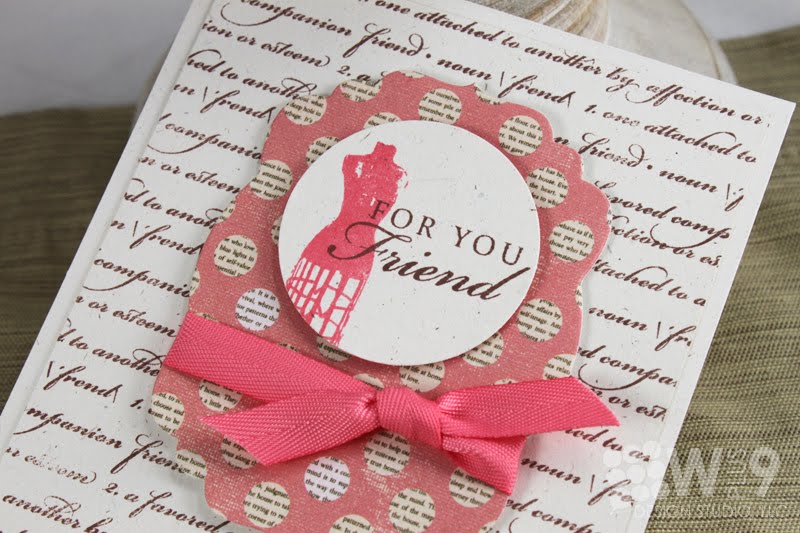
This is probably my personal favorite of the day. I started by stamping the "Friend" definition script background in chocolate.

For my focal point, I die cut a piece of patterned paper from the Uncommon collection by Authentique using Label Layers 2. I then stamped the smaller dress form from C'est la vie onto a 1.75" circle. I added the sentiment from Spring Post and tied it with a little twill before adhering with foam tape. So simple, yet sophisticated.

So there you have Day 1. I told you this was a good one! I hope you are as excited as I am. Be sure to stop by the rest of the Design Team to see more from these sets:

Would you like to win C'est la vie, Defining Words, and Label Layers 2? Leave me a comment by 11:59 PM EST July 7th to enter. I will select one random winner from all comments. Winners will be posted here.

Project Supplies

Tried & True
Stamps: C'est la Vie, A Special Lady (Wplus9)
Ink: True Black Archival Ink (Ranger), Acrylic paint (Ranger); Brilliant Blue (Stampin' Up!)
Cardstock: Rustic White (Papertrey Ink)
Patterned Paper: October Afternoon (Five and Dime collection); Crate Paper (Portrait collection)
Other: Embellishments (K&Company); Mulberry Rose (Recollections)
Fibers: Ruffled Eyelet Lace (Simplicity); Twine (Martha Stewart)

Mon Cher Ami
Stamps: C'est la Vie, Hope Seed Co. (Wplus9)
Ink: Stampin' Up!; Tim Holtz Distress Ink; Acrylic Paint (Ranger)
Cardstock: Papertrey Ink
Patterned Paper: Crate Paper (Portrait collection)
Embellishments: Pink Paislee (Butterfly Garden collection); Mulberry Rose (Recollections)
Fibers: Papertrey Ink; Canvas (craft supply)

Welcome Little One
Stamps: C'est la Vie, Kisses & Cuddles (Wplus9)
Ink: Stampin' Up!; Tim Holtz Distress Ink; Acrylic Paint (Ranger)
Cardstock: Papertrey Ink
Patterned Paper: Crate Paper (Portrait collection)
Embellishments: Pink Paislee (Butterfly Garden collection)
Fibers: Papertrey Ink; Canvas (craft supply)

For You Friend
Stamps: C'est la Vie, Defining Words (Wplus9)
Ink: Stampin' Up!
Cardstock: Papertrey Ink
Patterned Paper: Authentique (Uncommon collection)
Fibers: Papertrey Ink
Other: Label Layers 2 steel rule die (Wplus9)

Tuesday, June 28, 2011

Summer Happiness

If you are looking for our July Release countdown post, we have been delayed. Our sneak peeks will begin on the 7th this month and all sets will be available for purchase on July 10th. It will be an exciting one too, with 3 new stamp set and 2 new steel rule dies! In the meantime, I've got a little something to share with you today.

What can I say? I'm on a shabby chic/layered kick lately.

I had so much fun with this one. I paired the lovely Thrift Shop collection patterned papers from October Afternoon, along with Flora & Fauna I and Spring Post stamps to create this vibrant, fresh and crisp summery card.

These little tags are perfect to have on hand. You can mass produce the same design with a couple of different sentiments and color combos. Use them on the front of a card, or to add to a gift bag when you need something quick. Hope your week is off to a great start, thanks for stopping by!

Project Supplies

Stamps: Flora & Fauna I, Spring Post (Wplus9 Design Studio); Wedding Wordprints (Hero Arts)
Ink: Real Red, Tempting Turquoise, So Saffron (Stampin' Up!); Versamark; Jet Black Archival Ink (Ranger); Frayed Burlap (Ranger Distress Ink)
Cardstock: Rustic White (Papertrey Ink)
Patterned Paper: Thrift Shop collection (October Afternoon)
Fibers: Ribbon, twine (Papertrey Ink)
Other: Border punch (Fiskars); Buttons (Papertrey Ink); Doily (Wilton); ink blending tool (Ranger); sewing machine and thread

Monday, June 27, 2011

Papercrafts Magazine: Meet Cristina Kowalczyk

Join me in congratulating our very own Cristina as she is spotlighted over on the Papercrafts Magazine blog. Our very own cover girl, Cristina, has 10 cards published in the current Stamp It! Cards issue, including the cover!

Congratulations Cristina! Be sure to head over to the Papercrafts Magazine blog where they are giving away Wplus9's Poinsettia Patterns stamp set to two lucky commenters!

Tuesday, June 21, 2011

The Anatomy of Shabby Chic

Don't adjust your monitors. Yes, I said shabby-chic. I have been trying to hone my shabbiness. After doing some studying of the anatomy of a shabby-chic card by way of the beautiful creations of the likes of Sarah Martina Parker and Jean Martin, just to name a few - I have come to this conclusion:

I used a ton of product on this little number and have to admit, I quite like it. It's not award-winning by any means...but it is definitely so far from my usual, that I just have to feel a little bit good about it.

So what have I learned?

  • Color - color plays a huge part here. The colors can be contrasting or similar, but you definitely need something crisp to keep the colors from becoming too muddy. Trust me, there is a fine line between shabby and dirty.
  • Soften The Edges - if the color is dark, soften it with white. If it is light, soften it with brown/tan. Use a paint brush to apply or a blending sponged, be random, no deliberate pattern here.
  • Pattern - embrace the power of a pattern. Almost any pattern can be incorporated into a shabby chic card. Even if the colors seem to bright or the pattern too bold, refer to "Soften The Edges" and take it a step further and consider a spritzing with a Glimmer Mist to tone it tone a bit.
  • Alternate Layers - layers are a huge part in shabby-chic. To keep it from becoming too busy, alternate your layers. Started with a bold tight pattern? Make your next layer a softer or lighter pattern. Or try a solid color for your next layer (but don't forget to Soften The Edges)
  • Bring It Into Focus - Create a focal point with a group of smaller items that can be viewed as a whole - A die cut with a sentiment, a die-cut embellishment, and a tag perhaps. Just like with CAS, follow the rule of thirds, guide the eye, and bring it to the focal point.
  • Embellish, Embellish, Embellish - this part can be tricky, you can quickly end up with something that looks like grandma's trunk just exploded on your card. Cluster your embellishments in groups of three to start - a ribbon, a button, and a twine bow. Or perhaps a ribbon, a flower, and a stickpin.
  • Don't Forget The Lace - yeah, I don't care how you incorporate it - with a doily, trim, fabric, stamp it...just get it on there!

So there you have my - totally amateur - break down of the anatomy of shabby chic. Just my findings...feel free to add any pointers, I will take all I can get. Learning something new is always fun!

Project Supplies

Stamps: Flora & Fauna I, Filigreed Frames, Brothers & Sisters (Wplus9); Wedding Word Print (Hero Arts
Ink: Antique Linen distress ink (Tim Holtz by Ranger); Fresh Snow, Aqua Mist (Papertrey Ink); Chocolate Chip (Stampin' Up!); Sand Glimmer Mist (Tattered Angels)
Cardstock: Vintage White, Aqua Mist (Papertrey Ink)
Patterned Paper: Portrait Collection (Crate Paper)
Fibers: Seam Binding (Hug Snug); Jute twine (Papertrey Ink); Lace Trim (Simplicity)
Dies: All Occasion Label designer die (Wplus9); Mat Stack die (Papertrey Ink); Top Note die (Stampin' Up!)
Other: Mulberry Paper Mini Roses (Recollections); Doily (Wilton)

Monday, June 20, 2011

June - All Eyes On...You

Happy Monday all!

How was your Father's Day weekend? Ours was fantastic. I just have to take a small moment to say thank you to my husband -(cause I know he's reading) for being the most amazing father ever. We love you!

It's the 20th of the month and that means it's time for another All Eyes On. I thought it was about time to turn our eyes to the Flickr Gallery for another edition of All Eyes On You! And Wow! There have been some amazing additions to the gallery. I had a blast looking through all of the fantastic projects while looking for one to CASE. I was in need of a Father's Day card, so I was drawn to this one by Wendy:

First of all, let me just say this is perfect just the way it is. Rather than trying to selectively edit it, I chose to use the concept as a starting point. I love her "waves" of torn paper and her minimal color. The paper origami boat??? To Die For! I decided to take it in a cute and fun direction (another difficult style for me) and came up with this:

I used Guiding Light and Woodgrain Silhouettes for the sentiment. I still much prefer her version, but was so happy for the inspiration...and Jason loves it. So mission accomplished. ;o)

Thanks so much for stopping by today, and be sure to check out the rest of the design team to see who they chose to CASE:

Connect with us:

Follow Us on Pinterest