Thursday, June 8, 2017

Copic Coloring Detailed Leaves with Dawn

Hello! Today, I've got a labor of love for you. Yep, no sugar coating it here. LOL You all know that I'm a slow colorist, so this beauty was definitely a long one for me.

And it was worth every hour! I worked on coloring these images over several nights while catching up on some TV, and in truth, it probably took me about 5 hours to color everything. I didn't time it, but that's my best guess.

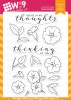
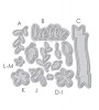
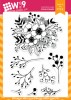
I stamped out several of the images from our Modern Peonies, Modern Anemones, and Modern Petunias stamp sets in Antique Linen Distress Ink on Neenah Solar White 80 lb Ultra Smooth cardstock - and got lost in coloring with Copic markers.

I did want to share a little of my process with you all. Since I've shared several versions of the florals, I decided to share how I approached coloring the leaves. Fair warning - it's a longer video and I did struggle a bit with voicing it over. I'm not sure why, but it is difficult for me to articulate what I'm doing when it comes to Copics.


Watch above or watch in HD at YouTube

Hopefully you will be able to pick up a few tips from the video none-the-less. And remember, there is no "right" way or "wrong" way, just the way that works for you!

I didn't keep track of the colors I used. When it comes to coloring florals, I rarely do. I've tried. I usually start out good...then, intuitively I will grab a random marker and forget to write it down and then remember 3 colors later...and well, yeah, you know how that goes. But, if there is a particular one, that you'd like me to create a video for, just leave it in the comments below and I will try to work it into a future video.

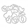
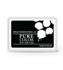
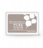
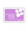
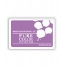
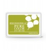
After I colored everything, I used their companion dies to die cut everything. I die cut a circle from masking paper and inked through it with Warm Wool Pure Color Dye Ink and then over stamped it with a Polka Dot background using Versamark Ink. The Versamark Ink actually "bleaches" our inks when applied over them, similar to the way the 0 Blender Copic marker works.

I then stamped my sentiment using our Pure Color Dye Ink in Black and adhered my arrangement of flowers. I adhered some elements directly to the card base and others with foam tape for a bit of dimension.

Thank you so much for stopping by. I hope you enjoyed!

Featured Supplies

For your convenience, here is a list of the featured supplies used on today's project(s), along with links to purchase. Please note: this list may contain some affiliate links.

Monday, June 5, 2017

Floral Pattern Stamping ft. Happy Wishes With Kara

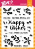
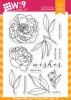
Hello and welcome back to the WPlus9 Design Blog! It's Kara and I wanted to share with you a fun background pattern I created with a few floral stamps from the Happy Wishes stamp set.

I love creating patterns with stamped images. To be honest, I normally just 'eyeball' my patterns. A lot can be corrected by die cutting the panel after it's stamped with a rectangle die. Position the die on the pattern just right and no one will know your pattern came out slightly tilted. ;)

After creating my test pattern for this design, I knew I'd need a few guidelines since the success of this pattern really relies on straight lines and the stamped images lining up just right. I created one vertical and one horizontal pencil line in the center of the card front. Once those main lines were stamped straight, it was easy to keep the rest of the pattern in line. I started with the four Bloomsberry flowers in the center and worked out from there. When all of the ink was dry, I was able to erase those pencil lines.

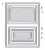
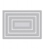
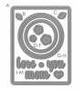
I needed to cover some of the pattern to create a neutral space for my sentiment, however I didn't want to cover it up completely. I used the 4 Bar Stitched Rectangles Die to die cut a piece of white cardstock smaller than the stamped panel. I also used the large circle from the Love Mom Layers die to create a window. This way not only does the pattern peek out from the window, but the fact that the white panel is smaller allows you to see the pattern around the edges as well.

I accented the tiny flowers in the pattern with a black dot using a little stamp from You Equal Kind. The sentiment is stamped on a banner from the Bountiful Blooms Die and finished it off with a few stamped and die cut flowers from the Happy Wishes set.

It's always handy to have a few birthday cards in your stash! Thanks so much for stopping by today. See you next time!

Featured Supplies

For your convenience, here is a list of the featured Wplus9 supplies used on today's project(s), along with links to purchase.

Friday, June 2, 2017

EASY Watercolored Floral Vignettes with Dawn

Hello and Happy Friday! I hope you have had a wonderful week and will have an even more wonderful weekend - it's summer!

In my last post I shared a little more advanced watercolor technique featuring our Modern Anemones stamp set. And during that post I promised to be back with an easier watercolor technique.


Watch above or watch in HD at YouTube

I created several versions of this card, all using the same images, with just slight variations. Just enough to keep them interesting for me while I was creating them. I don't know about you, but I'm a "one and done" kind of girl usually. Replicating the exact same design multiple times for me becomes monotonous and a bit of a chore.

A great way to keep it interesting is to switch up the color palettes.

I stuck with traditional colors for the original version of this card. I worked in layers, stamping and watercoloring the peony clusters first. I used a very simple application of color to create a casual feel. I knew the structure of the illustrations would carry the detail of the peonies, so I really didn't need to focus on anything but color.

After watercoloring the flowers, I added a wash of color to the background. After it was completely dry, I stamped the same leaves for a tone-on-tone look using our Hayride ink. I then stamped some filler berry images from our Botanical Bunch stamp set.

For the subsequent versions of this design, I decided to play with my color combinations.

I really loved the colors and decided to make a third version using the same colors but switched up where I used them. This gives the color palette a completely different feel as the quantities of each color in the overall design changed.

I hope you found today's video helpful. I really love this style and the casual feeling it has. Pairing it with a layered pattern approach really elevates it and makes the overall card so much more interesting. What do you think?

Thanks so much for stopping by!

Featured Supplies

For your convenience, here is a list of the featured supplies used on today's project(s), along with links to purchase. Please note: this list may contain some affiliate links.
Connect with us:

Follow Us on Pinterest