
Hey Guys! My husband and I recently took a vacation to the Caribbean. And, I think you can see that influence in my project today. The colors of the sea are so gorgeous and the combination of Sea Breeze, Ocean Drive, and Siren Song PURE COLOR Dye Ink is the perfect match!

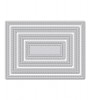
I started by adding color to a white card panel directly from the ink pad. Beginning with the lightest color, I swiped the ink pad across the piece of cardstock, covering approximately a third of the paper. When I was happy with the coverage I moved to the next color. I swiped the ink pad across the middle slightly overlapping the first color. I went back in with the first color to make sure the colors blended together rather than leaving a line. I did the same with the third and final color. Once the ink dried I die cut the panel with the 4 Bar Stitched Rectangle Die.

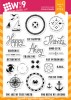
I knew I was creating this card for my brother's birthday so I went to my stash and pulled out some masculine sets. The first one I went for was Dockside. I absolutely love the design of this compass rose. I decided to do some collage style stamping, clustering elements and overlapping them to create interest and a focal point without covering up the beautiful blue/greens in the background.
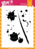
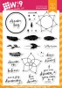
I stamped three clusters creating a visual triangle to draw your eye around the card. The cluster to the right is larger establishing it as the focal point. I started with the compass rose and then added the anchor and birthday sentiment, also from Dockside. I added in Ink Splats in the same color as the background to make those elements of the collage less prominent than those stamped in black. Some stars from Little Bits and a cluster of dots from Dream Believer finish it off.

With the same compass rose, I stamped another piece of white cardstock to create an envelope liner.

Thanks so much for stopping by!

Featured Supplies
For your convenience, here is a list of the featured Wplus9 supplies used on today's project(s), along with links to purchase.


Gorgeous card and idea!
ReplyDeleteThis is a really lovely card. I love the simplicity of the look but that it actually has layers of interest. So cool :)
ReplyDeleteCheers, Marie
Your blending is perfection, Kara... come teach me? Gorgeous colors, too, for this fun set...
ReplyDelete=]
Beautiful blending
ReplyDeleteextremely cool card and I'm lovin' the envelope liner you did too; thanx for the inspiration!
ReplyDeleteFabulous card Kara - LOVE how you created the beautiful ombre effect. Your brother will be delighted :-)
ReplyDeleteWow--I can't get over how smooth the blending is with direct-to-paper--great job! Love the overall design, too. I'm sure your brother will love it. Tfs! :) ~ Andrea
ReplyDelete