Showing posts with label Doodle Buds. Show all posts

Friday, February 24, 2017

Soft & Subtle Happy Wishes with Joni

Hello Everyone, Joni here sharing an inspiration using Doodle Buds stamp set and companion die set. This card has reminded me how versatile the entire set is. For today's project I decided to go with a more neutral color scheme.

For this project I also used Happy Wishes Words die for sentiment. The vellum leaves were die-cut from Under the Mistletoe die set and also used the large frame from Gift Card Layers die set.

To begin, I first die-cut my card base on a Kraft cardstock using the Gift Card Layers Die. Then cut a white card base a little smaller than an A2 card. The "Happy Wishes" sentiment was die-cut in white then colored with Copic markers.

Next, the flower images where stamped with Coconut Husk die ink and then colored with Copic markers. Then, then die-cut the flowers with its coordinating dies and adhered with foam tape.

Thank you so much for stopping by!

Featured Supplies

For your convenience, here is a list of featured supplies (or equivalents) used on today's project(s), along with links to purchase. Please note: this list does contain some affiliate links.

Thursday, July 7, 2016

From Inspiration to Design with Maureen

Hi all, it's Maureen. Today I want to talk about inspiration. Where do you all find it...Pinterest, home decor, stationary, nature? Inspiration is all around us! I am constantly taking pictures throughout the day of things that spark an idea for a card. This card design for instance was inspired by a dress I saw recently in a department store.

The dress was covered with black and white stripes from top to bottom with pink flowers lining the edge. Translating that onto a CAS card though - I quickly found that it was a bit too busy for my liking. So, I simplified the design by leaving the stripes in the upper third of the card base. I usually work in the bottom third, so this was a great way for me to change things up. It's always a good idea to change it up once in a while.

My color combination was inspired by a wall hanging that was in a movie I watched the other night. It was set in the 70's and I just loved the funky color combination. The You Equal Kind flowers are fun and funky, just perfect for the design.

Inspiration is all around us. Keep your eyes open, snap pictures of things that inspire you, and you'll never be lacking for mojo when you head to your work space again!


Featured Supplies

For your convenience, here is a list of the supplies (or equivalents) used on today's project(s), along with links to purchase. Please note: this list does contain some affiliate links.

Monday, March 21, 2016

GUEST ARTIST FEATURE: Wanda Guess

Hi there! It’s Wanda Guess, and I am so delighted to be here as a guest designer today! I have been a WPlus9 fan for a long time! Their stamps bring me lots of joy in my craft studio. I am also a huge fan of Dawn and her entire creative team. They make magic happen! I had a hard time deciding which stamp set I wanted to use for my post. I finally decided to use the gorgeous Doodle Buds Stamp Set and Companion Die along with some bright cheerful colors for Spring.

There is a whole lot of color going on here! I stamped my images in crisp black ink onto watercolor paper, and die cut them all out with the matching Doodle Buds dies. Then I had lots of fun coloring with my Kuretake Zig Clean Color Markers. The brighter the better!

The sentiments in the Doodle Buds stamp set are so pretty! I stamped the ‘hello’ on a white stitched circle and layered it onto another white circle for some more pop.

Here is a close up of the flowers. For this type of coloring I colored my markers directly onto the paper - and put down a lot of ink. Then I took my paint brush and water and mixed the color around until I got the effect I wanted. I used a couple of different shades for each flower and for the leaves.

In this photo you can see how I layered everything with lots of foam tape! The center of the main pink flower is a separate piece. I layered my card with bright yellow cardstock and black & white gingham.

I added a few lime green enamel dots at the end. I kinda love enamel dots!

This card would be pretty in muted colors, or all one flower too. They are so easy to make and easy to mix and match to your own style!

I hope you all have a wonderful, beautiful and creative day! Thanks to the lovely ladies at WPlus9 for having me!

Sunday, March 6, 2016

Stamp Layering with Kelly Latevola

Hello crafters! It's Kelly here, and I'm excited to share my take on combining old and new stamps.

For today's card, I've combined an older set called Quilt Prints with the more recent Doodle Buds. I love the idea of using a very traditional design like the quilt design with a fun and whimsical set.

You can watch me put them all together in the video below.

Watch above or watch in HD at YouTube

This allows you to not only stretch your stamps but get a completely different look. Quilt designs are traditionally more muted colors but the gorgeous blooms here give this card a punch of color that i just love.

Don't you just love how soft and pretty that Lake House ink is? I adore the way it blends out! I hope you enjoyed the video and will start thinking about combining your sets.

All stamps need love. :) Thanks for stopping by today!

Friday, December 18, 2015

CHALLENGE: Throwback Thursday #10

The quilted look has been popping up all over the paper crafting community so I thought this was the perfect time to highlight our throwback die set, Quilt Cuts 2.

This month I'll show you how to use Quilt Cuts 2 for last minute holiday cards, Winter thank yous and everyday note cards.


Wplus9 Supplies:

It doesn't get quicker or easier than this.  If you are looking for some last minute ideas, this is it.  simply die cut and assemble.  The best part that that you can use all of the die cut pieces to make multiple cards!

Not only are the Quilt Cuts perfect for the holidays, but they also work for Winter thank you cards or thank you cards for any time of the year. While I kept my design cool in color choice knowing I'd be using it after the holidays, you could go bold and make a graphic card instead!


Wplus9 Supplies:

This last card shows you just how versatile this set is!  It really can be used any time of year, for any occasion!

Play Along

Now it's your turn! We'd love to have you participate in our Throwback Thursday posts. We know you've got some older product in your stash dying to see some ink! So let's pull em out.
Use any card above as inspiration, or even the stamp set if you've got it, and let's see those "oldies but goodies" get some love! Use at least one Wplus9 product and upload your project to your blog or online photo gallery such as Flickr. Then link it up using the InLinkz widget below to share it and keep the inspiration flowing! You'll have 3 weeks to play along.
If you'd like us to repost and share your creations on Instagram and Facebook, be sure post using the hashtag #wplus9tbt!

Prize

We will select one random random participant to receive a $20 store credit to wplus9.com. Winners will be announced on Thursdays when the new Throwback Thursday is posted.


TBT #9 Winner

Contact us at customerservice@wplus9.com with your full name and email and we will set up your store credit! (If you don't already have an account set up with us, be sure to set one up to expedite collecting your prize)


Throwback Thursday #10 Entries

Thursday, October 15, 2015

Throwback Thursday Challenge #8 - Fair Isle Backgrounds


Our throwback set this month holds a special place in my heart.  Back in October of 2011, when this set released I was new to stamping.  I followed the WPlus9 releases every month but I still hadn't purchased anything.  I admit it,  I was a stalker :)   Until...I won the full October 2011 release.  Once I got these stamps in my hands, I was in love.  I've been a customer and fan ever since.  I still pinch myself that I'm on this awesome team.

Let me introduce to you this month's throwback stamp set is Fair Isle Backgrounds!


I've been seeing the Fair Isle print pop up a lot lately, so I decided this was a great time to feature Fair Isle Backgrounds.  I also wanted to show you that it isn't just for Holiday and Winter cards!

For my first card I paired Fair Isle Backgrounds with a stag to make the perfect masculine thank you card.   These two products are used mostly during the Winter and holiday season, but look at how perfectly these products work on a masculine card that can be given any time of year!


My next card uses the Fair Isle Backgrounds just to add a little pattern and to ground the leaf images.  The color palette makes this card versatile for giving any time of year.  Fair Isle Backgrounds is a perfect choice for Fall projects too.  Just change out the blues and add orange or red to give it more of a Fall feel. 


Wplus9 Supplies:
Stamps: Fair Isle Backgrounds, Holiday Cheer // Ink: Coconut Husk, Bo Peep, Silver Lining  Nautical Navy, Fairy Dust // Cardstock: Oatmeal // Dies: Love Mom Layers Die, Holiday Cheer Dies

Last but not least, a Holiday card!  I couldn't wrap up this post without including one of the newest additions to the WPlus9 product line, Holiday Cheer.   I can see myself using these two sets together a ton this holiday season. 


Play Along

Now it's your turn! We'd love to have you participate in our Throwback Thursday posts. We know you've got some older product in your stash dying to see some ink! So let's pull em out.
Use any card above as inspiration, or even the stamp set if you've got it, and let's see those "oldies but goodies" get some love! Use at least one Wplus9 product and upload your project to your blog or online photo gallery such as Flickr. Then link it up using the InLinkz widget below to share it and keep the inspiration flowing! You'll have 3 weeks to play along.
If you'd like us to repost and share your creations on Instagram and Facebook, be sure post using the hashtag #wplus9tbt!


Prize

We will select one random random participant to receive a $20 store credit to wplus9.com. Winners will be announced on Thursdays when the new Throwback Thursday is posted.


TBT #7 Winner

  • #1 Lindsey Larsen
Contact us at customerservice@wplus9.com with your full name and email and we will set up your store credit! (If you don't already have an account set up with us, be sure to set one up to expedite collecting your prize)


Throwback Thursday #8 Entries


Monday, June 22, 2015

PURE COLOR WITH KARA: Summer Anemones

Hey guys, It's Kara. I'm back with another PURE COLOR Combination. Summer is almost here and it's making me so happy! Today's card has a very summery color palette, bright sun and deep green grass.

This warm color palette features Wild Mango, Falling Star, Flamingo, Mojito, and Appletini PURE COLOR dye inks.

I started by stamping my design using Watercolored Anemones in Fairy Dust ink. This pale grey serves as a guide for stamping the flowers and leaves in my color palette. It is soft enough to fade into the background while also providing a slight shadow for my images. I stamped the flowers in Falling Star, Wild Mango, and Flamingo ink. The leaves and stems are stamped in Mojito and Appletini ink. I used the new Black ink to stamp my sentiment from Doodle Buds.

Wplus9 Supplies:
Stamps: Watercolored Anemones, Doodle Buds  // Inks: Wild Mango Dye InkFalling Star Dye Ink, Flamingo Dye Ink, Mojito Dye Ink, Appletini Dye Ink, Fairy Dust Dye Ink, Black Dye Ink  // Dies: Sunshine Layers, Love Mom Layers, Small Butterfly Frame// Cardstock: White, Coal Mine

I die cut the butterfly from white cardstock. Using sponge daubers, I added color starting on one side with a little Appletini ink. As I moved across the butterfly to the left wing, I switched to Mojito ink and then let it fade to almost white. I mounted the stamped panel on a piece of Coal Mine cardstock to add some contrast and pick up the color from the sentiment. Coal Mine is perfect for this card because it is not as stark a contrast as black.


Play Along

What do you think, want to give it a go? We'd love to see your take on this color combination! If you'd like to play along link up your collections below to keep the inspiration going.

Thanks so much for stopping by!

Friday, June 5, 2015

June 2015 Release Day & A Hop

Hello everyone, it's Release Day! Everything that the Design Team and I have been previewing is now available for purchase at wplus9.com, as well as at many of your favorite retailers. Remember, if we happen to sell out of something, be sure to check out the retailers, because they hit us hard this release and chances are, they'll have what you need.

I still have so much to share with you featuring the June 2015 Release, but first I want to give a big shout out to the Wplus9 Design Team who has done an amazing job - as always - but they really swung for the fences this month and I appreciate them and all they do more than words can express!

So today I'm pairing up my post up with the Pretty Pink Posh Watercolor Blog Hop! They are inviting everyone to hop along. It officially opens today, June 5th at 6am PST and ends June 8th at 11:55pm PST, so be sure to click the link or the graphic below to get all of the details and join the fun. There are many prizes to be won, including Wplus9!

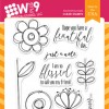
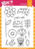
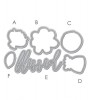
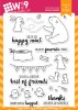
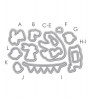
I decided to share all watercolor projects today featuring the new Doodle Buds stamp set and Companion Dies.

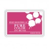
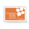
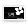
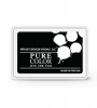
This card is just funky and fun. The whimsical doodles of this set make it perfect for the loose watercolor style. I did some ink smooshing in the background and made sure to add just a little of my favorite - splatters. All of the images were stamped onto watercolor paper using PURE COLOR dye ink in Black and then watercolored with Gansai Tambi watercolors. I am determined to use these more often. I normally go for the softer more muted tones in my watercoloring and I think that is one of the things that throws me off with these. But none the less, I put these babies to use on all of my cards today for some fun and eclectic little joys.

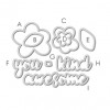
Once my flowers were dry, I die cut them using the Doodle Buds Companion Die and grouped them all together using a little foam tape to pop some of the elements up.

A little random stitching to mimic the design of the stamps, some black thread and of course, some Pretty Pink Posh sequins will finish this fun burst of color off!

Next up, I've paired some Copic airbrushing with watercoloring.

This uses a technique that I shared in a recent Online Card Class - Stretch Your Dies - that is pretty simple and makes a huge impact. By using the Doodle Buds Companion Die to create masks, I am able to airbrush a solid background to nestle my stamped images into.

Now I have clean, white open areas to do my watercoloring of each flower.

The sentiment, also included in the set, was stamped in PURE COLOR dye ink in Black onto White card stock and messily stitched to a piece of vellum. And of course...those black Pretty Pink Posh sequins...which I might be developing an addiction for.

And finally, a simple little card that would be sure to bring a lot of cheer.

I stamped all of my flowers and my sentiment in PURE COLOR dye ink in Black onto watercolor paper. Watercolored them and then colored and cut an extra leaf to pop up on foam tape for my little bird from Happy Mail perch on.

I hope that gives you some good ideas for using this set and watercolors in a loose way, that is fun and not intimidating in the least. In fact, the more irregular and messy you are with these, the cuter they look!

Design Team Inspiration

Not only do I still have more to share with you, but remember that amazing Design Team I mentioned? Wait until you see what they have for you:

Don't forget to check the Release Winner's Page to see if you are one of the lucky winners this week!

Thank you so much for joining us this week, for stopping by today, for the encouragement...for just making this the best hobby in the world!

Featured Supplies

Connect with us:

Follow Us on Pinterest